In the realm of email marketing, the dimensions of your email templates hold immense significance. They determine the visual appeal, readability, and overall effectiveness of your campaigns. In this comprehensive guide, we will delve into the world of email template dimensions, exploring their importance, types, and best practices. We will also provide invaluable tips and examples to help you design captivating and responsive email templates that resonate with your audience.
Email templates serve as the foundation for your email marketing efforts, providing a consistent and professional look and feel across all your campaigns. By understanding the intricacies of email template dimensions, you can optimize your emails for maximum impact, ensuring that your messages are delivered flawlessly to your subscribers.
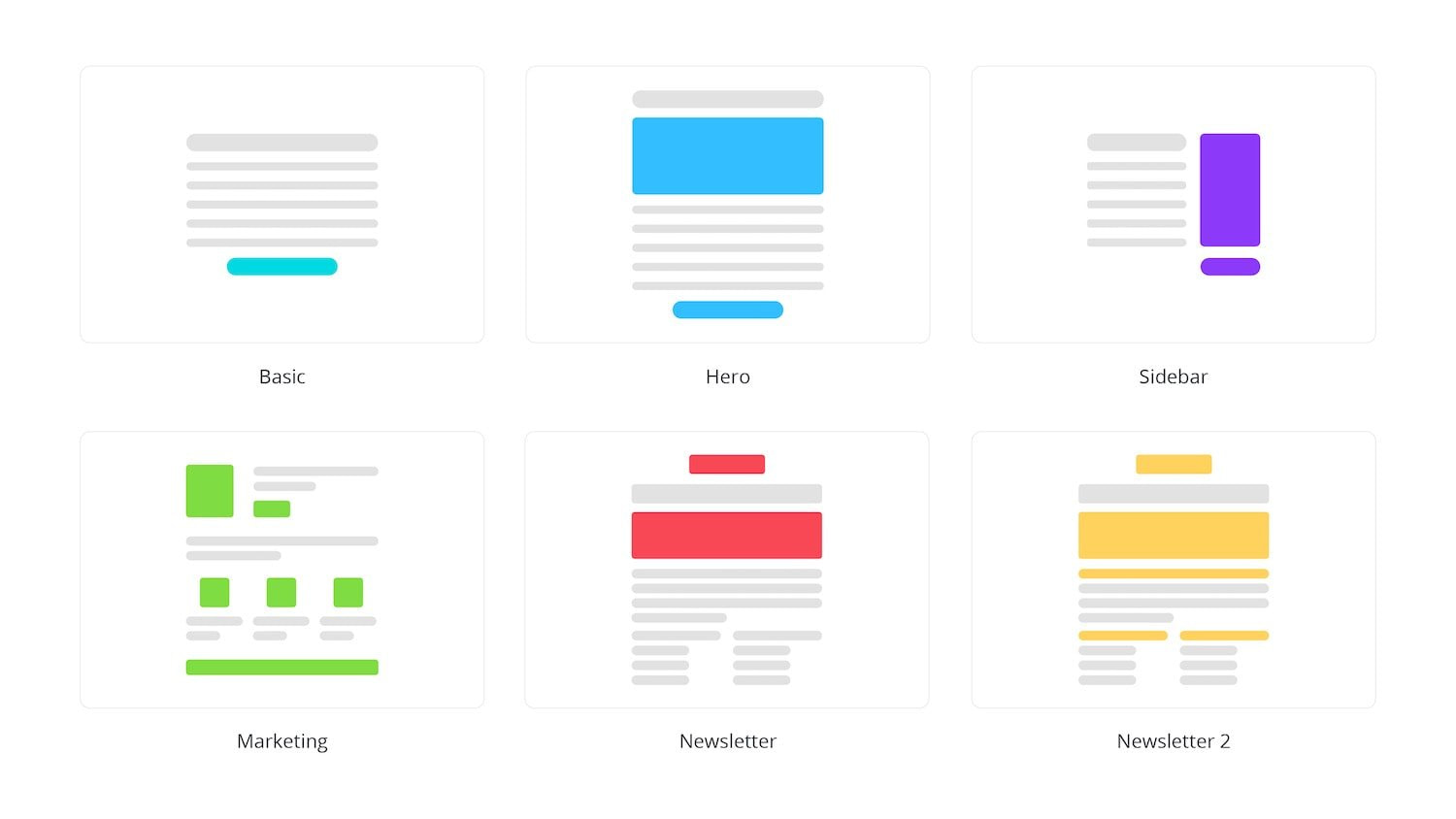
Email Template Dimensions

Email template dimensions are crucial in email marketing, as they determine the overall layout and presentation of your emails. Effective dimensions ensure your emails are visually appealing, easy to read, and compatible with various devices.
There are two main types of email template dimensions:
Standard Dimensions
- Width: 600-800 pixels
- Height: Variable, depending on content length
Standard dimensions are suitable for most email campaigns, providing a comfortable reading experience on desktops and mobile devices.
Responsive Dimensions
- Width: Fluid, adjusts to screen size
- Height: Variable, depending on content length
Responsive dimensions ensure your emails adapt to any device, providing an optimal viewing experience regardless of screen size.
Examples of Effective Dimensions
- 600px width for standard email templates
- 800px width for wide-screen email templates
- Responsive dimensions with a minimum width of 320px and a maximum width of 600px
Designing Email Templates

Designing visually appealing and effective email templates is crucial in modern marketing. Here are some tips to help you create templates that stand out:
Use of White Space: White space provides breathing room, improves readability, and draws attention to key elements. Use it strategically to guide the reader’s eye and create a clean, uncluttered design.
Typography
Typography plays a vital role in email design. Choose fonts that are easy to read, match your brand identity, and convey the desired tone. Experiment with font size, weight, and color to create visual interest and hierarchy.
Color
Color is a powerful tool to evoke emotions, establish brand recognition, and guide the reader’s journey. Use a limited color palette that complements your brand and creates a cohesive visual experience. Consider using contrasting colors to highlight important elements.
Examples of Well-Designed Email Templates:
- Airbnb: Simple and clean design with clear calls-to-action.
- Netflix: Personalized and visually engaging templates that showcase new releases.
- Spotify: Immersive and interactive designs that promote music discovery.
Responsive Email Templates
Innit bruv, when it comes to email marketing, responsive email templates are a right laugh. They make sure your emails look banging on any device, whether it’s a laptop, phone, or even a toaster.
Responsive email templates use clever coding to adjust their layout and design to fit any screen size. This means your emails will always be easy to read and navigate, no matter what device your mates are using.
Different Ways to Create Responsive Email Templates
There are a few different ways to create responsive email templates:
- Use a responsive email template builder: There are a bunch of online tools that make it easy to create responsive email templates, even if you’re not a coding whizz.
- Code it yourself: If you’re a bit of a coding ninja, you can code your own responsive email templates using HTML and CSS.
- Use a pre-built template: There are also a bunch of pre-built responsive email templates available online that you can use for free or for a small fee.
Examples of Responsive Email Templates
Here are a few examples of responsive email templates that you can check out:
- HubSpot’s Responsive Email Template
- Litmus’s 10 Free Responsive Email Templates
- Campaign Monitor’s Responsive Email Templates
Testing Email Templates
Yo, before you blast your email templates to your subs, it’s crucial to give ’em a test drive. This way, you can iron out any kinks and make sure they’re looking sharp on all devices.
There are a few different ways to test email templates:
Litmus Test
Litmus is a paid service that lets you preview your emails in a ton of different email clients and devices. This is super handy for making sure your templates look great no matter what platform your subs are using.
Email on Acid
Email on Acid is another paid service that offers similar features to Litmus. It also has a free plan that lets you test your emails in a limited number of email clients.
Mailchimp’s Inbox Preview
If you’re using Mailchimp, you can use their Inbox Preview tool to see how your emails will look in different email clients. This is a great option if you’re on a budget or just want to do a quick test.
No matter which method you choose, testing your email templates is essential for making sure your emails look their best and get the results you want.
HTML Table Tags
HTML table tags allow you to create tables within your email templates. This can be useful for presenting data or creating a more visually appealing layout.
To create a table, you use the
| tag.
For example, the following code creates a table with 4 responsive columns: “`html
“` You can also use HTML table tags to create more complex layouts, such as nested tables or tables with alternating row colors. FAQ SummaryWhat is the optimal width for an email template? The ideal width for an email template ranges between 600-800 pixels, ensuring compatibility with most email clients and devices. How can I create responsive email templates? To create responsive email templates, use fluid layouts, media queries, and percentage-based dimensions, allowing your templates to adapt to different screen sizes. What is the importance of white space in email design? White space enhances readability, improves visual appeal, and guides the reader’s eye through your email content, making it easier to digest and comprehend. |